Consequences of the “local bubble” on solar system
Introduction
As I described on the previous page, the solar system has been leaving its own galactic cloud (LIC) for about 100 years and is moving into another “cloud”, the “local bubble“. Due to this shift, the number of cosmic rays that usually reach the solar system has increased several times (from 5 to 7) and the latter are causing anomalies both on the Earth, on the Sun and on all the planets.
In the next paragraphs you will find the more detailed list of the consequences and confirmation that the time period is approximately 100/150 years.
Related Video
In this second video of the series «the Evidence» we will analyze 2 particular celestial arrangements.
The first is related to the position of the solar system in the Galaxy, our Milky Way.
The second concerns the arrangement of the gas planets with respect to the Earth.
In this third video clip of the series; the causes of the change of the planet, we will discuss the effects and causes of cosmic rays on the earth and the solar system.
As confirmed by decades of studies, the effect of cosmic rays on life and, in particular on viruses and bacteria, is to cause mutations.
With the increase in the flow of cosmic rays, mutations increase in direct proportion. For this reason, lately we are witnessing large animal deaths and subsequently various epidemics and pandemics.
Increase in earthquakes and volcanoes
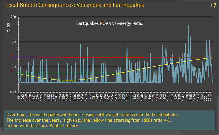
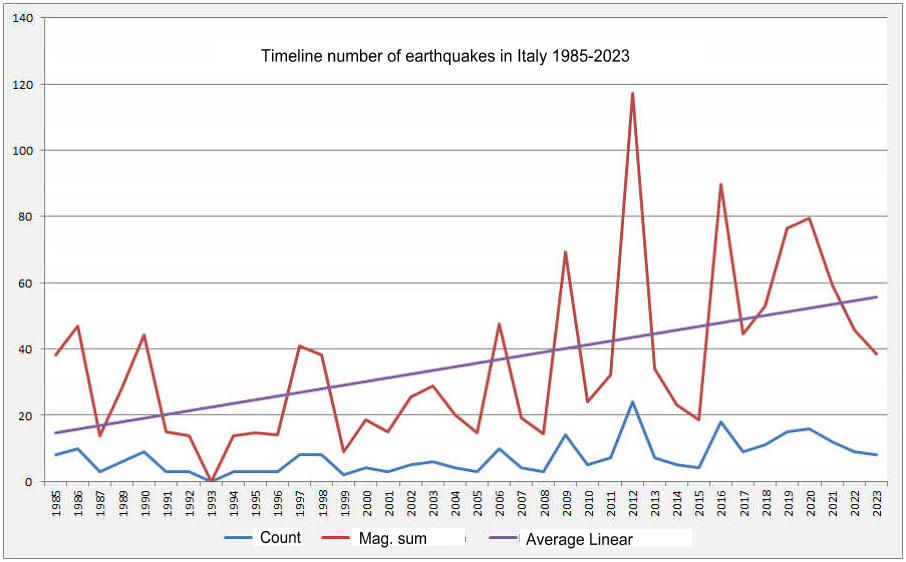
As always, I try to explain myself with graphs which, unlike mathematical calculations, help to understand the situation in the blink of an eye. Below are two graphs. The graph on the left is the result of a very difficult calculation which is to transform the amplitude (magnitude) of each earthquake that occurred over time and transform it into Energy.
It was not only possible to list the earthquakes by magnitude, but it was necessary to transform this amplitude into energy. Once I had cataloged the earthquakes that occurred from approximately 1500 to today (be careful, these texts are from 2016 but nothing changes because things have gotten worse in the meantime), I created many “timeline” graphs, among which the one below is perhaps the more explanatory.
In practice the “timeline” clearly indicates that there has been a significant increase. It should be noted that the increase curve began its rise more or less from 1800 and has continued to increase ever since. It should also be noted that the ratio between the average energy before 1800 and the average today is approximately 6 times. Exactly equal to the difference in density between the intergalactic cloud LIC (Local Interstellar Cloud) and the “cloud” of the intergalactic “void” into which our solar system is heading, or is already located.
As I had previously described, volcanic activity on earth is caused by cosmic rays: both solar and extra-planetary ones. As for earthquakes, after dozens and dozens of elaborate tables, there is no doubt that they are increasing.
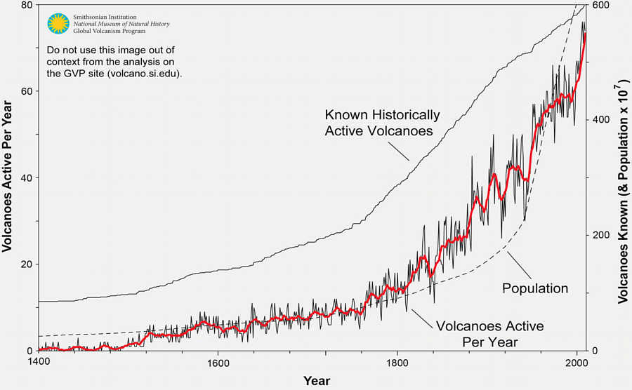
While as regards volcanoes, various publications, although seeing the increase (figure C) in eruptions, do not confirm it, pointing to the fact that eruptions have increased in step with the increase in the world population.
So as the population increased, the number of active volcanoes detected simultaneously increased. This theory, however, was valid only until the middle of the last century. By that time the detection stations of the main volcanoes had already been established and the satellites began to do their work.
Furthermore, as you can see from the table below, the population increase curve and the volcanic activity increase curve do not coincide 100% (Figure C).
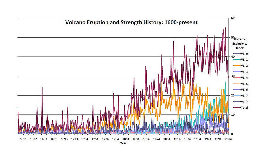
D – Timeline of volcanic eruptions from 1600 to today. The eruptions are divided by the VEI index (Volcanic Explosivity Index). Note the undisputed increase starting from 1800 as for earthquakes.
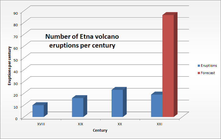
However, to confirm that the number of volcanic eruptions does not correlate with population growth, as had been postulated by some publications, just look at the number of eruptions of Mount Etna in Italy. The area around Etna has always been very populated, so there can be no cases in which an effusion/eruption has not been recorded.
This Wikipedia page lists eruptions over time over the last 300 years. One glance is enough to understand that in the last century, 1900 and in the current one, the increase has been very consistent, exactly at the level of the global increase. So the increase in population has little or nothing to do with it. Volcanic activity is increasing.
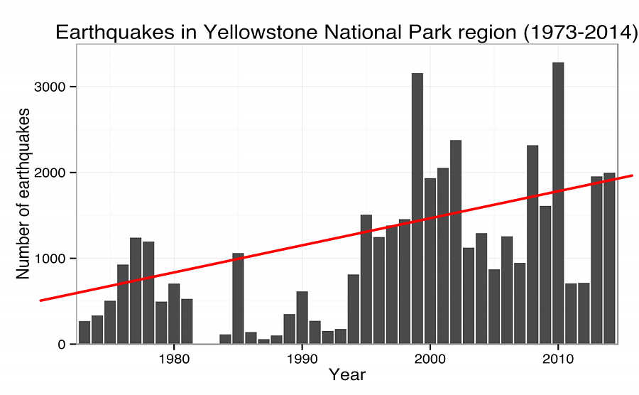
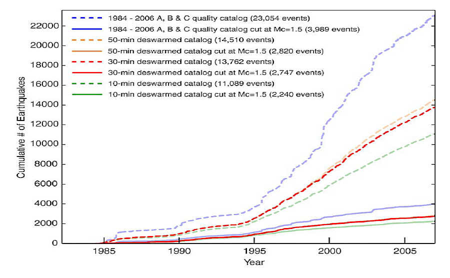
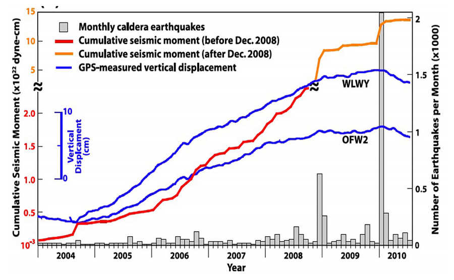
Yellowstone gives us another signal. Its caldera has been under observation for many years and, as can be seen from the graphs below (fig.E) Yellowstone is also experiencing an increase in activity in this last century. In addition to Yellowstone and Mount Etna, there are other places where, around the volcanoes, there have always been settlements and cities. Eruptions have always been recorded in these locations too and are on the increase.
In fact, the ratio, up to today, of the current volcanic activity and that of 1800/1850 is approximately 6 times, also in line with the theory of the “Local Bubble”.
H – Cumulative increase in the number of earthquakes in Yellowstone and worrying rise of the caldera.
So to conclude, both earthquakes and volcanic eruptions have increased significantly in the last century and a half. Indicatively, the increase is 6 times, i.e. as much as that predicted by the Local Bubble theory.
Global Warming
To date, the amount of Carbon dioxide (CO2) present in the atmosphere is approximately 410 ppm and has always risen over time. This gas produces the famous greenhouse effect where, even on Wikipedia, it is said that despite being a natural phenomenon, due to pollution caused by man, we find ourselves facing a rise in temperature.
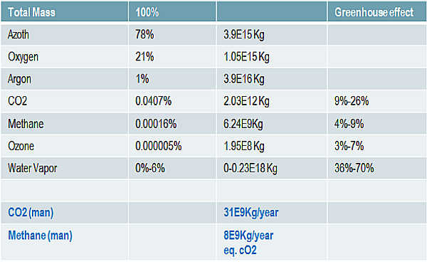
The table on the right lists the gases present in the atmosphere, including the offending CO2. The CO2 present in the atmosphere is 2000 billion kg while the CO2 produced by man is 31 billion kg (but much less in the 1900 century), approximately 64 times smaller. So these simple data already tell us that the greenhouse effect cannot be caused by human activity. Furthermore, CO2 is completely absorbed by plants and oceans.
But although the generation of CO2 by human activity is 60 times less than all the CO2 in the world, despite this, temperatures have always continued to increase over the last 100 years and more. So either the increase in temperature is not due to CO2 or there is an additional source of CO2 that we don't know about.
Volcanoes do not produce enough CO2 because their activity produces about 100-120 times less than man. So compared to the total on earth it remains an insignificant amount.
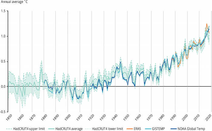
Below is the graph of the increase in general temperatures over the last 200 years. It should be noted that all these graphs start with their curves which then continue to rise from around the mid-1800s. In fact, that is the date from which the solar system began to move and emerge from its primordial “cloud”.
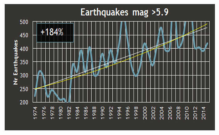
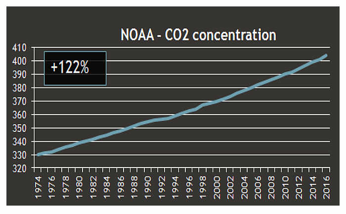
In the image above I have reported the curves of the increase in CO2 (Fig.L) and that of earthquakes (Fig.K) starting from 1975. The curves are very similar, then I checked the curves of the earthquakes of 1800 and CO2 since around 1800. These also match.
So is it possible that earthquakes are causing the increase in missing CO2? In my opinion, yes. In fact we must consider earthquakes as underground volcanoes and, like volcanoes, they emit large quantities of GAS. After the earthquake, the CO2 slowly reaches the surface and, being colorless and odorless, we do not notice it.
It has been confirmed for some time that, before any volcanic eruption, there are several earthquakes that increase the gas and magma in the caldera. So it is perfectly plausible that the majority of earthquakes are nothing more than underground volcanoes.
In fact, if you notice, each earthquake is associated with an epicenter, that is, the point from which the earthquake starts. Therefore the epicenter is nothing more than an underground volcano which, due to the strong pressures, generates earthquakes.
In the 20th century, 52 VEI4 (Volcanic Explosivity Index) volcanic eruptions occurred which we can match with the same power to an M5 earthquake. Also in the 20th century, 3 VEI 6 eruptions occurred which we can compare to an M7 earthquake. About 15 to 20 M7 earthquakes occur per year, which for 100 years becomes 1500/2000.
At this point we have a ratio of approximately 500/600 times and it is sufficient to bring the amount of CO2 produced to the earth. In fact, the CO2 emission from volcanoes is approximately 0.22 Gigaton (approximately 100-135 times less than man's anthropogenic emission). If we multiply 0.27 x 500 (or 600) we have 134 or 162 Giga tons of CO2 which are approximately 4/5 times the CO2 emission of modern man.
I realize that these are statements that change everything that is known about earthquakes and Plate tectonics theory. But, based on these data, with 162 Giga tons we have the answer we were looking for to the increase in CO2 in the atmosphere and as a consequence the increase in temperatures.
At this point we need to understand if the quantity released into the atmosphere is sufficient to increase the percentage. Let me explain: CO2 is absorbed by vegetation and oceans all over the world, and the more there is, the more they absorb. But there is a limit which is characterized by the land available from the vegetation.
We know, however, that in recent years CO2 has increased by a quantity which is: from 1974 330 ppm to 2016 410 ppm. A percentage increase of 24% so in each year 24 / (2016-1974) = 0.57%. Since we have 2000 Giga tons of it in the atmosphere, 0.57% is 11.4 Giga tons. It seems the earth can't handle more than 150+31-11=170 giga tons.
These are obviously calculations that can be questioned but the fact that all the curves (Volcanoes, earthquakes, CO2 and temperatures) start and develop in the same way makes us logically understand that the cause is only one: the movement of the solar system in the galaxy.
Natural disaster
Natural disasters go hand in hand with the changes that the entire Solar System is undergoing. In fact, for many years all the planets have shown more or less marked changes in their atmosphere and poles. The increase in intergalactic cosmic rays causes the following anomalies on the planets (I would like to point out that many of the data date back to 2016):
Mars: a series of transformations of the Martian atmosphere that increase the quality of its biosphere. In particular, an increase in cloud cover in the equator area and an unusual increase in ozone concentration.
Venus: Significant physical, chemical and optical changes observed on Venus; a reversal of dark and light spots detected for the first time and a sharp decrease in sulfur-containing gases in its atmosphere.
Earth: Overall volcanic activity has increased 500% since 1975. Natural disasters increased 410% between 1963 and 1993.
Jupiter: Jupiter has acquired such a high energetic charge that there is actually a visible tube of ionizing radiation that has formed between its moon, Io. You can actually see the light energy tube in the most recently taken photographs. Jupiter's magnetic field has more than doubled.
Saturn: Report of auroras on Saturn
Uranus and Neptune: Uranus' magnetic field is changing and becoming brighter. Uranus and Neptune appear to have had recent pole shifts. When the Voyager 2 space probe flew past Uranus and Neptune, the apparent north and south magnetic poles were significantly offset from where the rotation pole was located. In one case, the difference was 50 degrees, and in the other the difference was about 40 degrees, both quite large changes.
Pluto: A growth of dark spots on Pluto
The first reason for climate disasters is that the warming of the earth does not occur uniformly and therefore, due to strong temperature differences, climate disasters occur. But another possible cause that increased its intensity is the explosion of the supernova SN1987A in the Large Magellanic Cloud.
In fact it exploded (or its radiation arrived just when) at a time when the earth had warmed up a lot. So the effect of the supernova was to cool the sun, but the contribution of cosmic particles was very high, and in fact they increased the maximum temperatures but also caused violent frosts, so much so that some thought that we were at the beginning of a new mini era glacial. Very low winter and very high summer temperatures have led to ever-increasing natural disasters.
From studies it would seem that the supernova was very powerful because we received cosmic rays directly from its poles.(This was written in 2016) What will the future look like? For now, temperatures will continue to increase until we stabilize in the local bubble, but we will be 6/7 times more exposed to cosmic rays from supernovas and the center of the galaxy, or from bodies we don't know about.
Shifting of the magnetic poles.
Another cause due to the increase in cosmic rays is the rapid, increasingly rapid movement of the Earth's magnetic poles and their weakening.
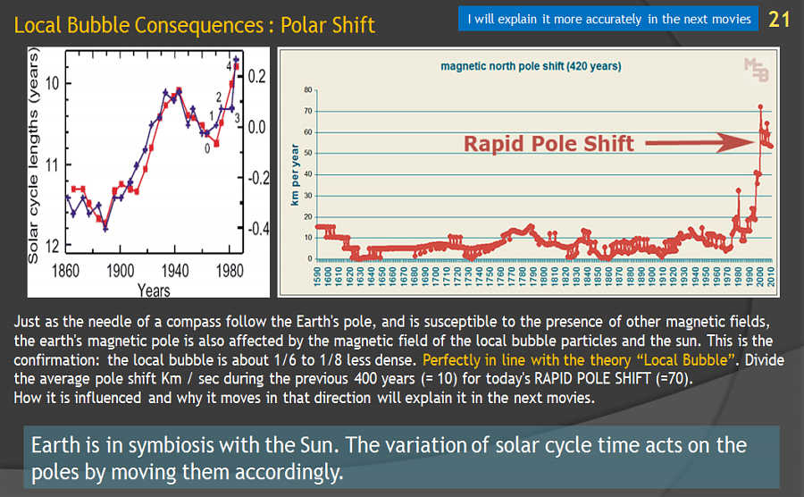
From the “Rapid Pole Shift” graph, shown below, we can see that the latter too, starting from 1900, began to move increasingly faster. If we compare the displacement of today's poles in km/year (about 60-70 km/year) with the average displacement of other periods (about 10 km/year) we have a ratio of 6-7 times exactly in line with the theory of “Local Bubble”.
We also note that, during the “Maunder Minimum” and the “Dalton Minimum”, i.e. the periods in which the Solar System was hit by cosmic rays from supernovae, the movements of the poles stopped. This makes us understand how the galaxy is in symbiosis with the Sun and the Earth and everything is connected.
We can compare these movements to a “spinning top” which, before falling, spins irregularly on itself. This is happening at the poles of the earth. For now it is not “falling”, but it makes us understand what is happening. The Earth's magnetic field depends on the Sun, and since the solar cycle is decreasing considerably, the Earth's poles bent towards the solar wind are rapidly moving to another position. The cause of this is always cosmic rays.
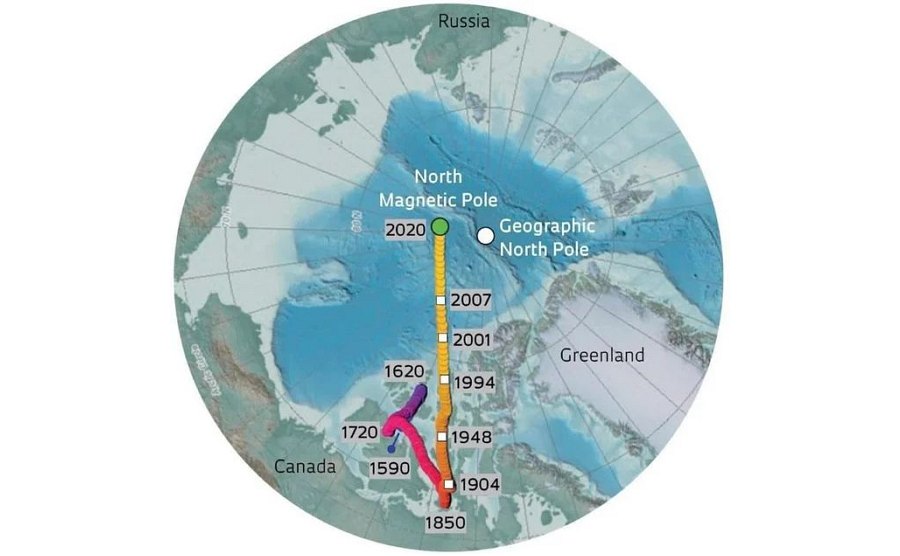
N – Position of the North Pole starting from 1620. Also note here that, starting from the end of 1800 until today, the North Pole has moved in a straight line in the direction of Russia. Since the Sun emerged from its primordial cloud (LIC), the poles have begun to move more erratically and rapidly.
In conjunction with the rapid shift of the poles we also see, from the graph on the left, that the Solar cycle varies in the same way. We notice that the “normal” 11-year cycle during which the Sun exchanges its magnetic poles is getting shorter. How intergalactic cosmic rays affect the Sun is a topic to be studied.
This gives us confirmation that, if the solar cycle shortens then there is something external that causes the change. Finally, cosmic rays from the Sun (solar wind) and galactic cosmic rays influence the position of the poles. Depending on the increase or decrease of the two sources, the poles move. All this confirms the theory of the movement of the Solar System from the LIC (Local Interstellar Cloud) to the Local Bubble.
Viruses, pandemics and animal deaths
Initially, in 2016 when I began my studies and published on YouTube, this chapter was dedicated only to animal viruses and pandemics. In fact, from that period large animal deaths began all over the world. Not a day went by without something like this happening. There were hundreds of them.
It seems that no one realizes it even today: millions of animals were dying and are dying from unknown causes. Worldwide and not in limited areas. The animals are both land, sea/river and sky animals. This means that the cause is something global.
This is a small list of sites where mass animal deaths are discussed:
Animals Are Dying in Droves. What Are They Telling Us?
Top 10 Strange Mass Animal Deaths
Mass Animal Die-Offs Are on the Rise, Killing Billions and Raising Questions
But a little Google search is enough: “mass animal death” About 223,000,000 results (0.49 seconds)
The reason why they die, also in this case, comes from the sky, always from cosmic rays. Official science has recognized for many years that cosmic rays act on DNA, altering it and causing mutations. Mutations are more frequent the higher the flux of cosmic rays. I will attach at the bottom all the links or PDFs of scientific publications that have studied how viruses and bacteria mutate when they are hit by x-rays, alpha, beta and even neutrons. They carried out experiments especially with neutrons years ago and, by bombarding samples of bacteria, they ascertained how quickly they changed.
In practice, life remains but continually adapts, and never remains static. In fact, many publications, and I will also attach these, have hypothesized that both the Zirca virus that appeared in Brazil in 2015 and COVID-19 originated from cosmic rays in periods in which the sun was at its minimum activity (when the Sun is at its minimum period, the solar wind produced and the associated magnetic field are weaker so that many more extragalactic particles reach the Earth). In fact, even human skin, when exposed to too much UV radiation, in some cases, changes, resulting in skin cancer.
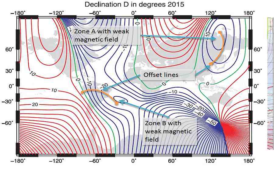
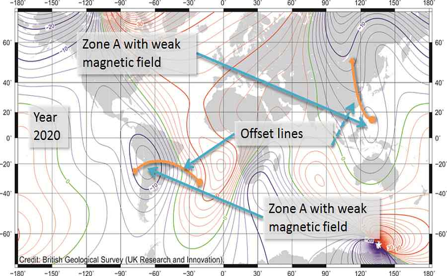
In fact, the publications were right, but there is a second reason why more mutations arrive in certain areas of the globe: the model of the Earth's magnetic field (Magnetic Model). As you can see in the slider of the figures below, there are areas on the earth where the magnetic field generally has “holes”. The magnetic field always shifts over the years but the “weaker” areas always remain the same.
On the slider these areas are marked with an arrow: 4 of these areas are at the North Pole; One is located in South America and moves both East and West depending on the period between Peru and Brazil, more towards Brazil; another is found in Siberia and often reaches south to China. These 2 countries already tell us something: the Zirka epidemic in Brazil in 2015 and the Covid19 pandemic in 2019 which started from China.
Therefore these “holes” in the Earth's magnetic field allow more cosmic radiation to pass through and, due to the countless mutations, in the same areas there is a greater probability that a virus, by mutating, becomes “lethal” for the population. This is what most likely happened.
But let's go back to the animal massacres because for many years millions had been beached or falling from the sky, and this, already at that time, had made me assume that sooner or later a mutation would also affect humans. I wrote about the Zirca virus in 2016 but I knew it could have been much worse. I also understood that the animals died because they had no shelter or “assistance” or knowledge like we have. If every animal catches a virus/bacterium its end is almost certainly sealed. But for humans it is different because we have homes, rest, food and medicines for healing available.
But in 2019 covid arrived and everyone went crazy. Masks and gels for the entire population and then in the end it was understood, as has been stated by many scientific studies, that they were of no use but actually made the situation worse. There's no need for me to explain it because it seems too banal to me on a childish level but the fear of that period led to this. Even worse, all the human rights of those who understood and did not want to be part of the collective psychosis were violated.
But in the end the true number of deaths from Covid was never known because the hospitals declared deaths from Covid which however were fake, all to take more illegal money from the government. The corrupt rulers themselves purchased more masks than necessary precisely to pocket more money from the sale. I should dedicate a whole other chapter to the other great deception, that of vaccines, but I will write everything in the area dedicated to Biblical references. Because what happened and still happens today with this pressure on serum was already written in the Bible thousands of years ago.
So to recap: cosmic rays cause more mutations in viruses in direct proportion to their flux. The high number of mutations increases the chances that a lethal virus/bacterium will affect some animal or man.
Cosmic Ray
The cause of all these changes are cosmic rays. But have they really increased over time? And what kind of rays are increased?
It is very difficult to make an account, a report, of the flow of Cosmic Rays (I will use the acronym CR from now on). This is because there are many measurement methods, but each has flaws. I won't explain everything and will refer to future articles. Just to summarize there are 4 methods used:
– Neutron detectors which however have the flaw that they do not always point in the same direction, so they also detect extra galactic rays which are few but powerful and cause confusion. They also cannot detect radiation blocked by the Van Allen belts
– Stratospheric balloons have the above defect they cannot detect radiation blocked by the Van Allen belts. They are also very sensitive to the phases of the Sun.
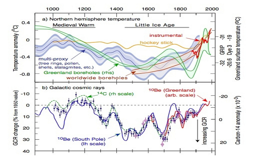
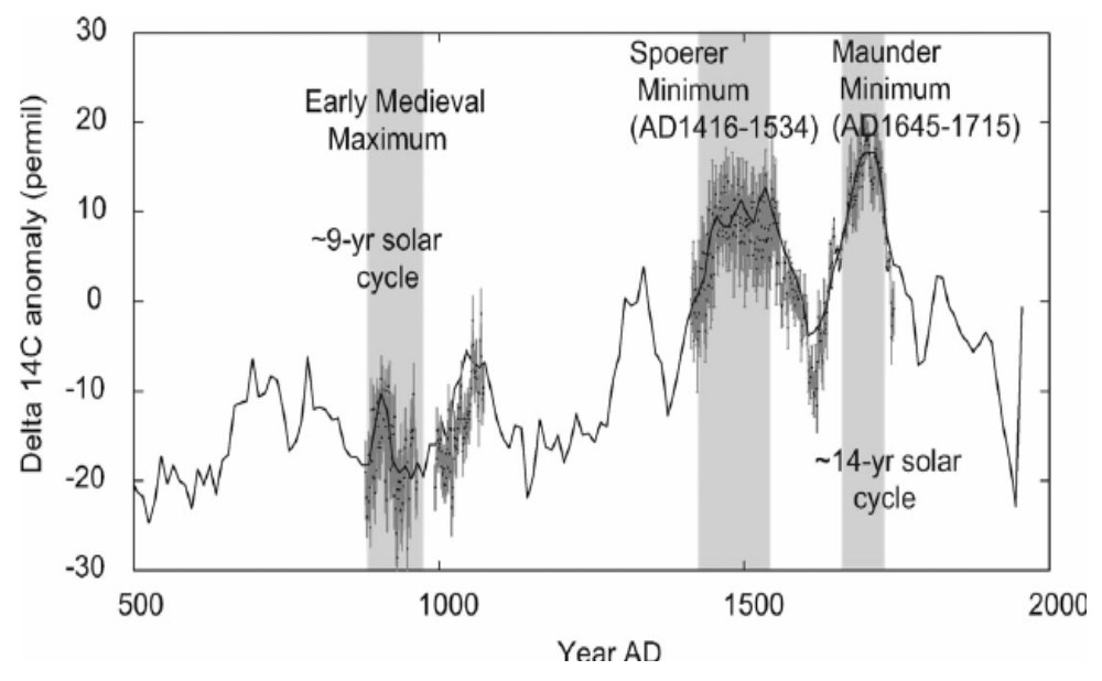
– Measurement of carbon 14 from polar “carrots”. Based on the density of carbon-14 contained in a section of ice extracted from the poles, one can get an idea of the incidence of cosmic rays based on the period. Not very precise but has a very long timeline.
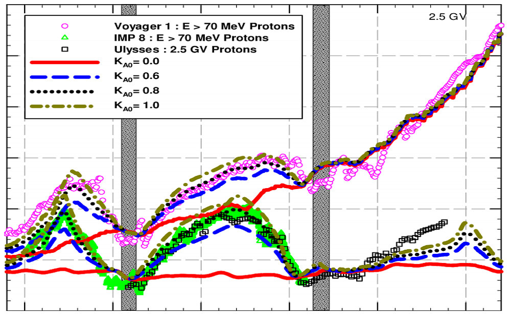
– Measurement by space probes. Several space probes have cosmic ray sensors. Unfortunately, the majority only do a mapping and having been put into orbit a few years ago they cannot give us a clear trend of the actual flow of CRs. But we have 4 probes with which we can use them.
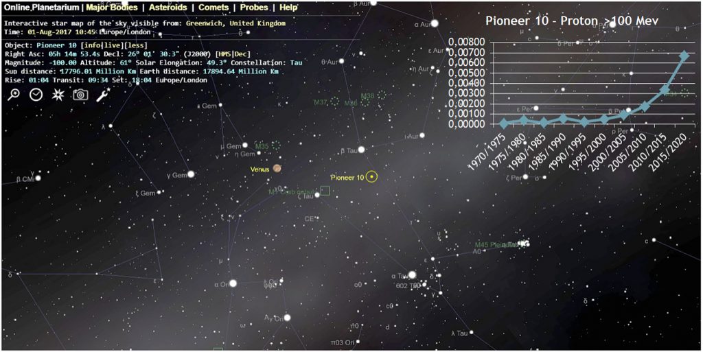
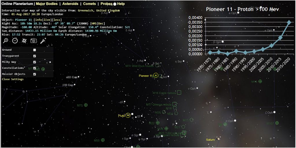
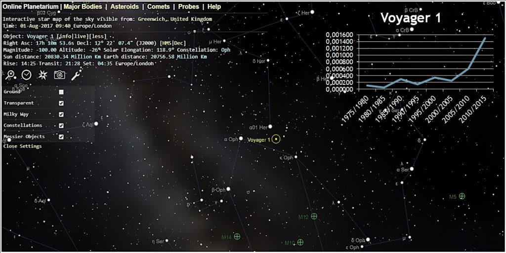
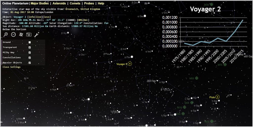
These are the space probes launched in the 1970s by NASA: Pioneer 10 and Pioneer 11 and also Voyager 1 and Voyager 2. All 4 probes were equipped with CR sensors. The best data are obtained with Pioneer 10 which is in the direction of one of the galactic arms. In fact, since there are more stars there are both more luminosity and more cosmic rays.
Q – Position in the sky of the Pioneer 10 space probe. It is located in the constellation of “torus” in the direction of one of the galactic arms. Note the increase in cosmic rays about 7-fold from about 1970 to 2020. Online Planetarium.
R – Position in the sky of the Pioneer 11 space probe. It is located in the constellation of the “shield” (scutum) in the direction of the Milky Way but shifted by a few degrees. Note the increase in cosmic rays which is smaller than in Pioneer 10. Online Planetarium.
S – Position in the sky of the Voyager 1 space probe. It is located in the constellation of “Hercules” a few degrees distant from one of the galactic arms. Note the approximately 5-fold increase in cosmic rays from about 1975 to 2015. Online Planetarium.
T – Position in the sky of the Voyager 2 space probe. It is located in the “Peacock” constellation very distant from the galactic arms. Note the approximately 5-fold increase in cosmic rays from about 1975 to 2015. Online Planetarium.
So the space probes that started many years ago give us a report that the CRs have increased. The increase is also higher than the value I expected from the Local Bubble theory, but we must take into account that over the years the probes have moved away from the Sun and its magnetic field and this has meant that more and more CR could be detected.
These rays are Protons with a kinetic energy of >100 Mev which is the typical average energy of CRs arriving from the Galaxy. These rays, being very powerful, are poorly shielded by the Solar magnetic field.
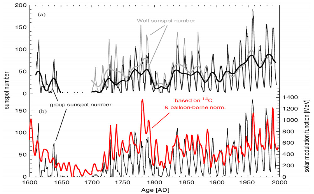
To provide further confirmation, I report below the graphs and the source of studies done with the extraction of ice cores to measure the percentage of Carbon-14.
Below we find, just for confirmation, various graphs that indicate the increase. Be careful, however, a distinction must be made between the high-power Cosmic Rays arriving from the galaxy/supernovae and the low-power ones: both cause effects on the solar system. Those with high power tend to increase volcanoes which bring periods of cold/famine/pandemics, while those with low power bring periods of heat and if this heat increases also famines/pandemics. However, the topic is very complex and I will try to explain it in detail when I publish everything else.
Consequences of a supernova today
In view of all this I asked myself the question of what could be the consequences of the explosion of a supernova visible to the naked eye on our planet and the solar system in the present day.
First of all, as I had previously written, the danger limit of a supernova explosion, based on the effects I documented, had gone from 50 light years calculated by astronomers to 500-1000 light years.
This is because I had ascertained the effects and then multiplied them as a function of the square of the distance (the closer the supernova is, the more energy reaches the earth).
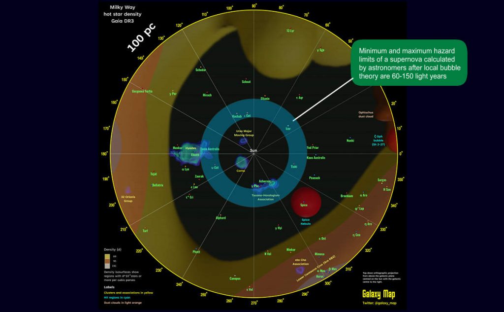
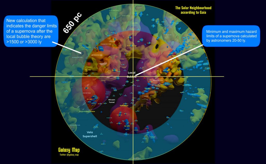
Now, however, after official science theorizes that the earth is in a less dense cloud and with much more radiation, this distance must also be recalculated. Since the calculated density is 5 to 7 times compared to before (this process of exit from the stellar cloud began more than 100 years ago), then the maximum distance at which a supernova can become harmful also increases by the square root (the effects of radiations are proportional to the square of the distance) of 5 and 7 which is 2.23 and 2.64. Therefore the new risky distances become from a minimum of 1100 AL to a maximum of 2600 AL. Supernova(s) this “close” have never exploded, but if it were to explode at this time, the effects will be much more damaging due to the position of the solar system in the galaxy.
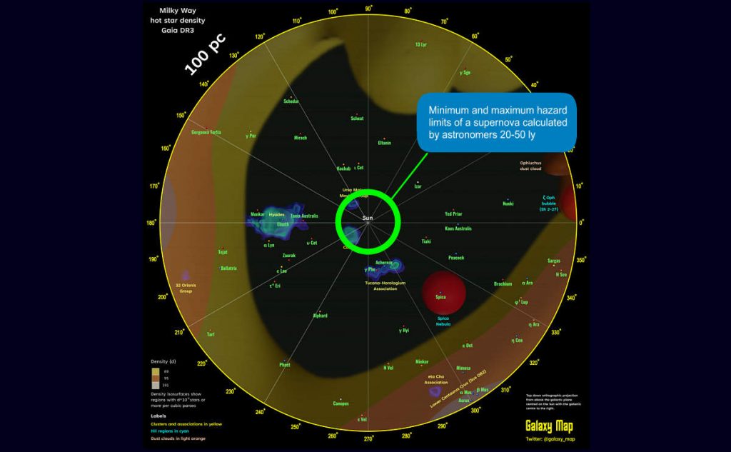
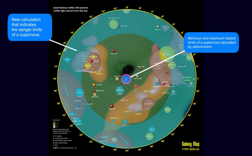
In the photos below all the visual comparisons of the danger limits of supernovae recalculated starting from the “base” one of the astronomers of 20-50 light years up to the last one calculated based on the Local Bubble theory which reaches up to >1500-> 3000 light years. Thanks to ESA for the Gaia mission star maps.
If you want to continue there are many other “discoveries” but first I would like to recap everything to bring order. Please click the button below for the “Evidence Study Summary” section.
References
- When a Sleeping Giant Awakes
- Is Italy's Super Volcano Getting Ready to Erupt?
- Are Natural Disasters Increasing? Statistics & Trends
- Earth’s Magnetic North Pole Is Shifting Toward Siberia and Raising Questions About Unusual Movement
- A Perfect Storm of Cosmic Rays (2019 before the pandemic)
- Pandemics Will be More Frequent - PMC - NIH
- Galactic Cosmic Rays - Space Weather Prediction Center


Leave a Reply